Create Standalone Geographic Bubble Chart from Table Data
This example shows how to create a standalone geographic bubble chart from table data by using the geobubble function. Within the example:
Load county and Lyme disease data for New England into a table.
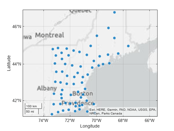
Create a geographic bubble chart from the table.
Visualize the populations by changing the sizes of the bubbles.
Visualize the number of Lyme disease cases by changing the colors of the bubbles.
Standalone geographic bubble charts created by the geobubble function do not support customizations such as changing the line width and transparency of bubbles, adding text and line annotations, and moving the size and color legends. To create a similar chart that supports more customizations, create a bubble chart in a geographic axes by using the geoaxes and bubblechart functions. For an example that uses the geoaxes and bubblechart functions, see Combine Bubble Chart with Other Graphics in Geographic Axes.
Load Data
Load a table containing county data and Lyme disease data for New England. The table contains these table variables:
LatitudeandLongitude— Latitude and longitude coordinates, respectively, for each county.Population2010— The population of each county in 2010.Cases2010— The number of Lyme disease cases in each county in 2010.
counties = readtable("counties.xlsx");Create Geographic Bubble Chart
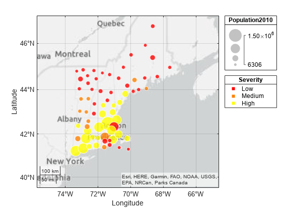
Create a geographic bubble chart by using the geobubble function. Pass the table as the first argument to the function, followed by the table variables that contain the latitude and longitude coordinates. Return the GeographicBubbleChart object in gb. Then, adjust the geographic limits by using the geolimits function. By default, all the bubbles are the same size and color.
gb = geobubble(counties,"Latitude","Longitude");
geolimits([40.8 47.0],[-76.71 -63.22])
Specify Bubble Size
Visualize the county populations by changing the sizes of the bubbles.
Set the SizeVariable property of the bubble chart object to the table variable that contains the population data. When you specify the bubble sizes using a table variable, the bubble chart includes a size legend.
gb.SizeVariable = "Population2010";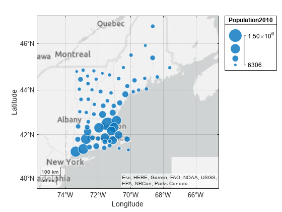
For more information about controlling the sizes of the bubbles, see Control Bubbles in Standalone Geographic Bubble Charts.
Specify Bubble Colors
Visualize the number of Lyme disease cases by changing the colors of the bubbles.
Categorize Color Data
Geographic bubble charts require categorical color data. In general, you can create categorical arrays by using the categorical or discretize function.
Categorize the number of Lyme disease cases by using the discretize function. Use these names and edges for the bins:
"Low"— 0 to 50 cases"Medium"— 51 to 100 cases"High"— 101 to 500 cases
cases = counties.Cases2010;
categories = ["Low","Medium","High"];
binnedCases = discretize(cases,[0 50 100 500],"categorical",categories);
Add the categorized data to a new variable in the source table for the bubble chart object. Then, set the ColorVariable property of the bubble chart object to the new variable. When you specify the bubble colors using a table variable, the bubble chart includes a color legend.
gb.SourceTable.BinnedCases2010 = binnedCases;
gb.ColorVariable = "BinnedCases2010";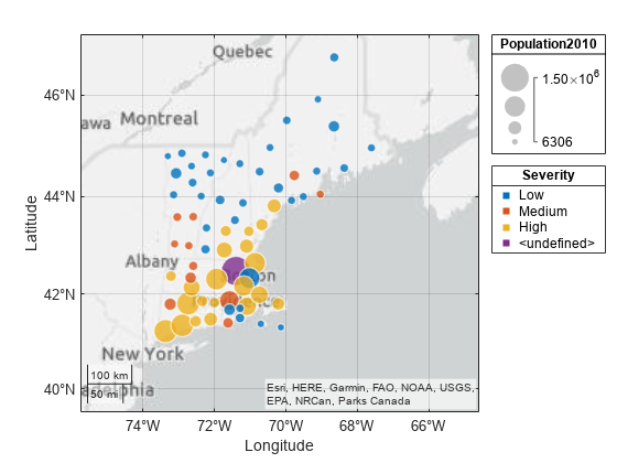
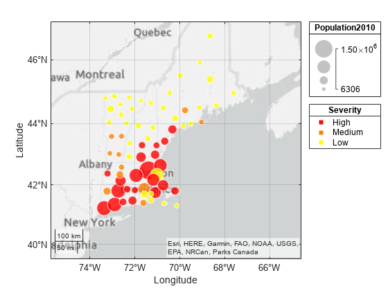
Resolve Undefined Color Data
The color legend contains an undefined category because standalone geographic bubble chart objects do not ignore undefined color values. An undefined color category can appear when the original data, in this case the Cases2010 variable, contains values that are empty or outside the bin edges. Investigate and resolve the undefined category.
Find the table rows that contain undefined color values. Then, find the number of Lyme disease cases associated with the table rows.
tf = isundefined(gb.SourceTable.BinnedCases2010);
idx = find(tf); % table rows
gb.SourceTable.Cases2010(idx) % number of cases
ans =
514
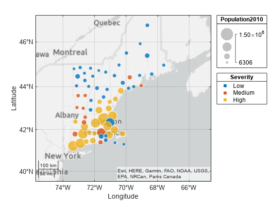
The categorized data only accounts for cases in the range [0, 500], but this county has 514 cases. Recategorize the data, this time using bin edges with an upper bound of 514.
rebinnedCases = discretize(cases,[0 50 100 514],"categorical",categories);Replace the categorized data in the source table with the recategorized data. The updated color legend does not contain an undefined category.
gb.SourceTable.BinnedCases2010 = rebinnedCases;
Specify Bubble Colors
Specify new bubble colors by creating a colormap with the same number of colors as categories. Then, change the bubble colors by setting the BubbleColorList property of the bubble chart object.
n = length(categories);
cmap = autumn(n);
gb.BubbleColorList = cmap;
The bubble chart uses red to indicate a low number of cases and yellow to indicate a high number of cases. Switch the red and yellow colors by reordering the categories.
gb.SourceTable.BinnedCases2010 = ...
    reordercats(gb.SourceTable.BinnedCases2010,["High","Medium","Low"]);
For more information about controlling the colors of the bubbles, see Control Bubbles in Standalone Geographic Bubble Charts.
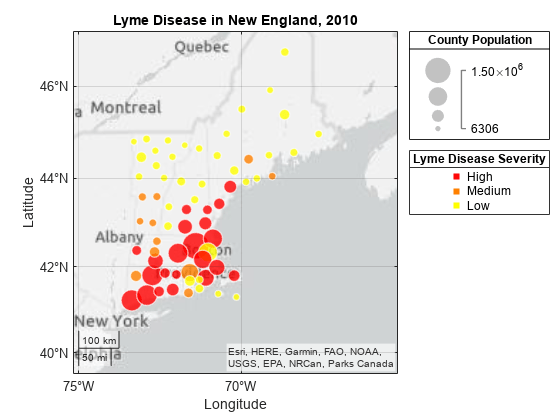
Specify Chart and Legend Titles
Add a title to the bubble chart.
title("Lyme Disease in New England (2010)")By default, the legend titles match the names of the table variables. Change the titles of the size and color legends by setting the SizeLegendTitle and ColorLegendTitles properties of the bubble chart object.
gb.SizeLegendTitle = "County Population";
gb.ColorLegendTitle = "Lyme Disease Severity";
Refine Table Data
Many of the large bubbles are red, which suggests that more Lyme diseases cases occur in densely populated areas. Update the bubble chart to visualize locations with the most cases per capita.
Normalize the data by calculating the number of cases per 1000 people.
casesPer1000 = counties.Cases2010 ./ counties.Population2010 * 1000;
Add the normalized data to a new variable in the source table. Then, update the bubble chart by setting the SizeVariable property to the new variable. Update the title of the size legend.
gb.SourceTable.CasesPer1000 = casesPer1000;
gb.SizeVariable = "CasesPer1000";
gb.SizeLegendTitle = "Cases Per 1000";
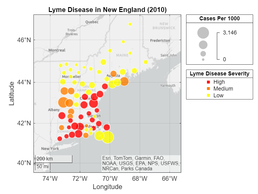
The bubble chart with normalized data shows that the highest number of cases per capita has a different geographic distribution than the bubble chart with unnormalized data.