Main Content

Push Button

Change parameter or variable value using button

  • Push Button block

Libraries:
Simulink / Dashboard

Description

Use the Push Button block to change the value of the connected variable or parameter before or during simulation. You can configure the button to change the value only while you press the button or to latch the value change until you click the button again. Use the Push Button block with other Dashboard blocks to create an interactive dashboard to control your model.

Double-clicking the Push Button block does not open its dialog box during simulation or when the block is selected. To edit the block parameters, you can use the Property Inspector or open the block dialog box by:

  • Double-clicking the block when the block is not selected and the model is not simulating.

  • Right-clicking the block and selecting Block Parameters from the context menu.

Push Button Icons

You can add an icon to the Push Button block that is displayed alongside the button text. You can choose an icon from a predefined set that includes basic shapes, automotive indicators, and wireless icons, or you can upload your own custom icon. For more information, including a complete list of the built-in icons, see Icon.

When you add an icon to the Push Button block, you can configure an on color and an off color for the icon so its color changes with the state of the block and specify the alignment of the icon relative to the button text. For example, this Push Button block is configured to use a circle icon with the on color specified as bright green, aligned to the left of the button text.

Push button block with a green circle icon to the left of the button text.

The icon settings for the Push Button block allow you to configure the appearance of the block in your model. When you want to customize the appearance of the block further, consider using the Push Button block in the Customizable Blocks library. The Push Button block in the Customizable Blocks library supports adding a custom icon but does not include any built-in icons.

Connect Dashboard Blocks

Dashboard blocks do not use ports to connect to model elements. To connect a dashboard block, use connect mode. To enter connect mode on an unconnected block, pause on the block you want to connect and click the Connect button . To enter connect mode on a connected block, select the block, pause on the ellipsis that appears (…), and in the action menu that expands, click the Connect button.

To connect a control block to a parameter in your model or to change the connection of a control block, enter connect mode. Select the block to whose parameter you want to connect. From the list that appears, select the parameter to which you want to connect. Then, pause on the dashboard block and click the Done Connecting button .

The control block cannot connect to a parameter defined by a variable until you update the model diagram. To connect to a parameter defined by a variable or to modify the value of a variable that defines the value of a connected parameter when the simulation is not running, update the model diagram by pressing Ctrl+D.

You can connect to a parameter with a scalar value or to an element of a matrix or structure. For more information, see Connect Dashboard Blocks to Simulink Model.

You can also connect dashboard blocks to a Stateflow® chart. For more information, see Connect Dashboard Blocks to Stateflow (Stateflow).

This animation shows how to connect the Push Button block to your model.
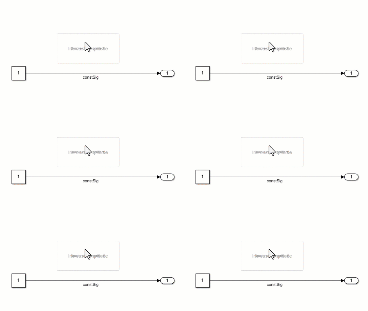
An unconnected Push Button block connects to the Value parameter of a constant block.

Parameter Logging

Tunable parameters connected to dashboard blocks are logged to the Simulation Data Inspector, where you can view the parameter values along with logged signal data. You can access logged parameter data in the MATLAB® workspace by exporting the parameter data from the Simulation Data Inspector by using the UI or the Simulink.sdi.exportRun function. For more information about exporting data using the Simulation Data Inspector UI, see Export Data to Workspace or File. The parameter data is stored in a Simulink.SimulationData.Parameter object, accessible as an element in the exported Simulink.SimulationData.Dataset.

Examples

expand all

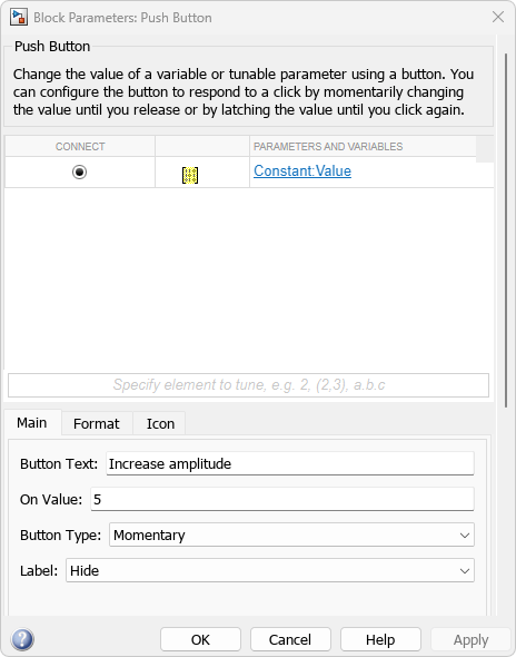
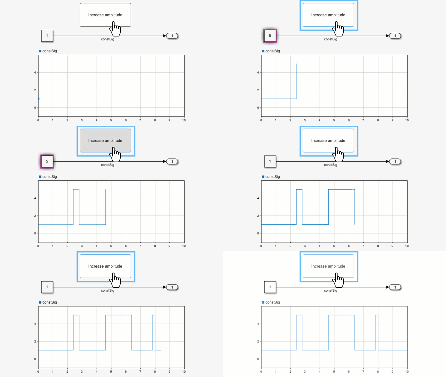
You can use a Push Button block to change the value of a connected variable or parameter during simulation. For example, in the model pushIncrease, a Push Button block named Increase amplitude is connected to the Value parameter of a Constant block. When you press the Push Button block, the value of the Constant block changes to 5.

The Block Parameters dialog box for the Push Button block

Simulate the model. To increase the value of the Constant block from 1 to 5 during simulation, press the Push Button block.

Animation of the pushButton model during simulation

Extended Examples

Limitations

  • Except for the Dashboard Scope block and the Display block, dashboard blocks can only connect to real scalar signals.

  • You cannot use the Connection table in the Block Parameters dialog box to connect a dashboard block to a block that is commented out. When you connect a dashboard block to a commented block using connect mode, the dashboard block does not display the connected value until the you uncomment the block.

  • Dashboard blocks cannot connect to model elements inside referenced models.

  • When you simulate a model hierarchy, dashboard blocks inside referenced models do not update.

  • Dashboard blocks do not support rapid accelerator simulation.

  • When you connect a dashboard block to a variable or parameter during simulation, the data for that variable or parameter is not logged to the Simulation Data Inspector. To log variable and parameter data to the Simulation Data Inspector, connect the dashboard block to the variable or parameter prior to simulation.

  • When you simulate a model in external mode with the Default parameter behavior set to Inlined, dashboard blocks can appear to change parameter and variable values. However, the change does not propagate to the simulation. For example, Gain blocks display changes made to the Gain parameter using the dashboard blocks, but the Gain value used in the simulation does not change.

Parameters

expand all

Connection

Dashboard blocks do not use ports to connect to model elements. To connect dashboard blocks to parameter values in your model, use connect mode, the Simulink® Toolstrip, or the Connection table in the Block Parameters dialog box. You can connect to a parameter with a scalar value, or to an element of a matrix. For information about connect mode and how to connect using the toolstrip, see Connect Dashboard Blocks to Simulink Model.

To connect a control block to a parameter with a scalar value or change the connection of a control block to a parameter with a scalar value using the Connection table:

  1. Select the block.

  2. To connect the block, in the Property Inspector, on the Parameters tab, click Connect. To change the connection of the block, click Change instead.

  3. Select the block to whose parameter value you want to connect.

  4. In the table, select the parameter to which you want to connect.

  5. Click Apply.

The control block cannot connect to a parameter defined by a variable until you update the model diagram. To connect to a parameter defined by a variable or to modify the value of a variable that defines the value of a connected parameter when the simulation is not running, update the model diagram by pressing Ctrl+D.

You can also connect dashboard blocks to a Stateflow chart. For more information, see Connect Dashboard Blocks to Stateflow (Stateflow).

Programmatic Use

To programmatically connect a dashboard block to a tunable parameter, use a Simulink.HMI.ParamSourceInfo object. The Simulink.HMI.ParamSourceInfo object contains four properties. Some properties apply to connecting dashboard blocks to parameters defined by values, and some apply to connecting dashboard blocks to parameters defined by variables. Not all fields have a value for a connection because a given dashboard block connects to either to a parameter defined by a value or to a parameter defined by a variable.

Block Parameter: Binding
Type: Simulink.HMI.ParamSourceInfo
Default: []

Main

The text displayed on the Push Button block in your model.

Tips

To design a button that displays different text depending on the state of the block, use the Push Button block in the Customizable Blocks library.

Programmatic Use

Block Parameter: ButtonText
Type: string or character array
Default: 'Button'

The value assigned to the connected block parameter when the button is pressed or latched.

Tips

Use the Block Type parameter to configure how the block responds to a click:

  • Momentary — The button applies the On Value only while you press it.

  • Latch — The button latches the state change when you click it and applies the On value until you click it again.

Programmatic Use

Block Parameter: OnValue
Type: string or character array
Default: '1'

Specify how the button responds to a click.

  • Momentary — The button applies the On Value only while you press it.

  • Latch — The button latches the state change when you click it and applies the On value until you click it again.

Programmatic Use

Block Parameter: ButtonType
Type: string or character array
Value: 'Momentary' | 'Latch'

Position of the block label. When the block is connected to an element in the model, the label is the name of the connected element.

Programmatic Use

Block Parameter: LabelPosition
Type: character vector
Values: 'Hide' | 'Bottom' | 'Top'
Default: 'Hide'

Format

Block background opacity, specified as a scalar value between 0 and 1.

Example: 0.5

Programmatic Use

Block Parameter: Opacity
Type: scalar
Default: 1

Block foreground color, including the text. You can select a color from a palette of standard colors or specify a custom color.

Programmatic Use

Specify the ForegroundColor parameter for the block as a string or a character vector that defines a 1-by-3 [r g b] vector with values between 0 and 1.

Block Parameter: ForegroundColor
Type: character vector | string
Values: [r g b] vector

Block background color. You can select a color from a palette of standard colors or specify a custom color.

Programmatic Use

Specify the BackgroundColor parameter for the block as a string or a character vector that defines a 1-by-3 [r g b] vector with values between 0 and 1.

Block Parameter: BackgroundColor
Type: character vector | string
Values: [r g b] vector

Icon

You can add an icon to the Push Button block to display alongside or instead of the button text. You can choose from built-in shape, automotive, and wireless icons, or you can upload your own custom SVG, PNG, or JPEG file to use as the icon.

To view icon options, on the Icon tab of the block dialog box, select an Icon Type. To use your own custom icon, select Custom as the Icon Type and upload the image file.

When you add an icon, you can configure the icon appearance using these parameters:

  • Icon Alignment — Alignment of icon relative to button text

  • On Color — Icon color when block is pressed or latched and applying the On value to the connected parameter

  • Off Color — Icon color when the block is not pressed or latched and is not applying the On value to the connected parameter

To specify an On Color and Off Color for the icon, you must select Customize Icon Color.

Shape Icons

IconBasic Shapes Library Block NameProgrammatic Use Value

Check1 icon: a check mark

Check1Check1

Check2 icon: a check mark with slightly curved lines

Check2Check2

Check3 icon: the outline of a check mark

Check3Check3

Check4 icon: a check mark with a divot along its outline

Check4Check4

Circle icon: a solid black circle

CircleCircle

Ex1 icon: a cross mark

Ex1Ex1

Ex2 icon: a cross mark with one curved line

Ex2Ex2

Ex3 icon: the outline of a cross mark

Ex3Ex3

Ex4 icon: a cross mark with a divot along the outline

Ex4Ex4

Face icon: the outline of a face with a closed mouth in a straight line

FaceFace

Frown1 icon: the outline of a face with an open downturned mouth

Frown1Frown1

Frown2 icon: the outline of a face with a closed downturned mouth

Frown2Frown2

Hexagon icon: a solid hexagon

HexagonHexagon

Pentagon icon: a solid pentagon

PentagonPentagon

Rectangle icon: a solid rectangle

RectangleRectangle

Smile1 icon: the outline of a face with an open upturned mouth

Smile1Smile1

Smile2 icon: the outline of a face with a closed upturned mouth

Smile2Smile2

Solid Face icon: a solid face with a closed mouth in a straight line

Solid FaceSolidFace

Solid Frown1 icon: a solid face with an open downturned mouth

Solid Frown1SolidFrown1

Solid Frown2 icon: a closed downturned mouth

Solid Frown2SolidFrown2

Solid Smile1 icon: a solid face with an open upturned mouth

Solid Smile1SolidSmile1

Solid Smile2 icon: a solid face with a closed upturned mouth

Solid Smile2SolidSmile2

Square icon: a solid square

SquareSquare

Triangle icon: a solid triangle

TriangleTriangle

Automotive Icons

IconAutomotive Indicator Lamps Library Block NameProgrammatic Use Value

Adaptive Cruise Control icon: a speedometer with an arrow pointing to a tick mark and the silhouette of a car in the background

Adaptive Cruise ControlAdaptiveCruiseControl

Adaptive Cruise Control Failure icon: a speedometer with an exclamation mark next to it and the silhouette of a car in the background

Adaptive Cruise Control FailureAdaptiveCruiseControlFailure

Anti-Lock Brake System icon: a circle labeled "ABS" in a set of parentheses

Antilock Brake SystemAntilockBrakeSystem

Battery icon: the outline of a battery with a plus symbol on the positive pole, and a negative symbol on the negative pole

BatteryBattery

Check Engine icon: the outline of an engine labeled "Check Engine"

Check EngineCheckEngine

Check Engine2 icon: the outline of an engine with the silhouette of a lightning rod on it and the word "CHECK" underneath it

Check Engine2CheckEngine2

Cruise Control icon: a speedometer with an arrow pointing to one of the tick marks

Cruise ControlCruiseControl

Eco Mode icon: a solid leaf shape labeled "ECO"

Eco ModeEcoMode

Electronic Stability icon: a circle labeled "ESP" in a set of parentheses

Electronic StabilityElectronicStability

Engine icon: the silhouette of an engine

EngineEngine

Engine Coolant Temp icon: a thermometer with waves in the background

Engine Coolant TempEngineCoolantTemp

Engine Failure icon: the silhouette of an engine with an exclamation mark on it

Engine FailureEngineFailure

Engine Heating icon: the silhouette of an engine with three wavy arrows pointing upwards on it

Engine HeatingEngineHeating

Engine Oil icon: the silhouette of an oil can

Engine OilEngineOil

Exterior Bulb Failure icon: the silhouette of a glowing light bulb with an exclamation mark on it

Exterior Bulb FailureExteriorBulbFailure

Front Fog Light icon: the outline of a fog light lamp emitting rays of light to the left that are depicted as diagonal lines on top of a wavy vertical line that represents the fog

Front Fog LightFrontFogLight

Fuel icon: the silhouette of a gas pump with an arrow pointing left on it

FuelFuel

Hazards icon: the outline of a warning triangle

HazardsHazards

Headlamp Leveling icon: the outline of a lamp emitting rays of light with an arrow pointing clockwise above them and an arrow pointing counterclockwise below them

Headlamp LevelingHeadlampLeveling

High Beams icon: the outline of a lamp emitting horizontal rays of light

High BeamsHighBeams

Hill Descent Control icon: the outline of a car driving down a slope

Hill Descent ControlHillDescentControl

Lighting Switch icon: the silhouette of a glowing light bulb

Lighting SwitchLightingSwitch

High Beams icon: the outline of a lamp emitting rays of light that run diagonally downward

Low BeamsLowBeams

Parking Assistance icon: the letter "P" next to a solid triangle, and the "P" emits a detection signal represented as three curved lines aimed at the triangle

Parking AssistanceParkingAssistance

Rear Fog Light icon: the outline of a fog light lamp emitting rays of light to the right that are depicted as horizontal lines on top of a wavy vertical line that represents the fog

Rear Fog LightRearFogLight

Side Lights icon: the outline two lamps emitting rays of light to the left and right

Side LightsSideLights

Stability Control icon: the silhouette of a car with wavy lines behind it

Stability ControlStabilityControl

Stability Control Off icon: the silhouette of a car with wavy lines behind it and the word "OFF" underneath

Stability Control OffStabilityControlOff

Tire Monitor icon: the outline of the cross-section of a tire with an exclamation mark on it

Tire MonitorTireMonitor

Traction Control icon: the outline of the cross-section of a tire with the label "TC"

Traction ControlTractionControl

Traction Control Off icon: the outline of the cross-section of a tire with the label "TC" and a diagonal slash through the whole image

Traction Control OffTractionControlOff

Traction Control Failure icon: the outline of the cross-section of a tire with the label "TC" and an exclamation mark next to it

Traction Control FailureTractionControlFailure

Turn Signal Left icon: a solid arrow pointing left

Turn Signal LeftTurnSignalLeft

Turn Signal Right icon: a solid arrow pointing right

Turn Signal RightTurnSignalRight

Wireless Icons

IconIcon NameProgrammatic Use Value

Network icon: the wireless internet connection icon

NetworkNetwork

Network No Signal icon: the wireless internet connection icon grayed out,with a crossed-out circle next to it

Network No SignalNetworkNoSignal

Network Transmission icon: a wireless internet tower

Network TransmissionNetworkTransmission

Network3G icon: the wireless internet connection icon with "3G" next to it

Network3GNetwork3G

Network4G icon: the wireless internet connection icon with "4G" next to it

Network4GNetwork4G

Network5G icon: the wireless internet connection icon with "4G" next to it

Network5GNetwork5G

Tips

  • You can change the icon for a Push Button block using the Button tab in the toolstrip.

  • If you want to customize the appearance of the Push Button block further, consider designing your own button using the Push Button block in the Customizable Blocks library.

    The Push Button block in the Customizable Blocks library supports adding a custom icon but does not include any built-in icons.

  • The on and off colors for the icon can apply to these SVG elements:

    • altGlyph

    • circle

    • ellipse

    • path

    • polygon

    • rect

    • text

    • textPath

    • tref

    • tspan

Programmatic Use

Block Parameter: Icon
Type: string | character vector
Default: 'Default'

Alignment of the icon relative to the button text. When you do not specify button text, the icon is always in the center of the block.

Programmatic Use

Block Parameter: IconAlignment
Type: string | character vector
Value: 'Left' | 'Right' | 'Top' | 'Bottom' | 'Center'
Default: 'Left'

When you add an icon to the Push Button block, you can specify on and off colors so the icon color changes to reflect the state of the block. To use and specify the On Color and Off Color for an icon, select Customize Icon Color.

Programmatic Use

Block Parameter: IconColor
Type: string | character vector
Value: 'On' | 'Off'
Default: 'Off'

When you add an icon to the Push Button block, you can specify on and off colors so the icon color changes to reflect the state of the block. The On Color specifies the color of the icon when the block is pressed or latched and is applying the On value to the connected parameter. You can select a color from a palette of standard colors or specify a custom color.

Dependencies

To enable the On Color parameter, select Customize Icon Color.

Programmatic Use

Specify the IconOnColor parameter for the block as a 1-by-3 [r g b] vector with values between 0 and 1.

Block Parameter: IconOnColor
Type: [r g b] vector

When you add an icon to the Push Button block, you can specify on and off colors so the icon color changes to reflect the state of the block. The Off Color specifies the color of the icon when the block is not pressed or latched and is not applying the On value to the connected parameter. You can select a color from a palette of standard colors or specify a custom color.

Dependencies

To enable the On Color parameter, select Customize Icon Color.

Programmatic Use

Specify the IconOffColor parameter for the block as a 1-by-3 [r g b] vector with values between 0 and 1.

Block Parameter: IconOffColor
Type: [r g b] vector

Block Characteristics

Data Types

double | half | integer | single

Direct Feedthrough

no

Multidimensional Signals

no

Variable-Size Signals

no

Zero-Crossing Detection

no

Extended Capabilities

Version History

Introduced in R2015a

expand all

Go to top of page