controlchart
Control charts
Syntax
Description
controlchart( creates an X-bar chart of the
measurements in the matrix X)X. The X-bar chart plots the arithmetic mean
of each subgroup, and indicates out-of-control points that are more than three standard
deviations above and below the mean of X.
controlchart(___,
specifies options using one or more name-value arguments in addition to any of the input
argument combinations in the previous syntaxes. For example, you can specify the control
limits, specification limits, and chart type.Name=Value)
stats = controlchart(___)
Examples
Load the parts data set and display its size.
load parts
size(runout)
ans = 1×2
36 4
The matrix runout contains 36 subgroups. Each subgroup contains four replicate measurements of the same quantity.
Create X-bar and R (range) control charts for the data, and return the subgroup statistics.
stats = controlchart(runout,ChartType=["xbar","r"]);

Display the process mean and standard deviation.
stats.mu
ans =
-0.0864
stats.sigma
ans =
0.1302
The X-bar chart plots the arithmetic mean of each subgroup. The green center line indicates the mean of all the elements of runout, and the red lines indicate the upper and lower control limits.
The R chart plots the range of each subgroup. The green center line indicates the mean range, averaged over the subgroups.
In both charts, the circled points indicate subgroups that violate the control limits.
Load the parts data set and keep only the first measurement of each subgroup.
load parts
X = runout(:,1);
Create I (individual) and MR (moving range) control charts. Use a window width of two measurements to calculate the moving range.
controlchart(X,ChartType=["i","mr"],Width=2)

The I chart plots the individual measurement values in sequential order. The MR chart plots the absolute difference between each measurement and the previous measurement. The green center line in each chart represents the mean quantity, and the red lines represent the control limits.
Generate a simulated data set X that contains pass or fail measurements of 10 units, taken on 40 consecutive days. Each day represents a subgroup, and each unit measurement has a 20% chance of indicating a failure. Represent a failure as a logical 1 (true) and a pass as a logical 0 (false).
rng(0,"twister")  % For reproducibility
failureProbability = 0.2;
randomMatrix = rand(40,10);
X = logical(randomMatrix < failureProbability);
Create P (proportion of units that are defective) and NP (number of defective units) control charts of the measurements. Return the subgroup statistics and plotted point values. Specify a unit size of 1 to indicate that each element in X is a logical value for a single unit.
[stats,plotted] = controlchart(X,ChartType=["p","np"],Unit=1);

The P chart plots the fraction of failure measurements in each subgroup. The NP chart plots the number of failure measurements in each subgroup.
Display the mean fraction of failure measurements.
stats.p
ans =
0.2200
Display the indices of points that are out of control.
find(plotted(2).ooc)
ans =
16
Subgroup 16 is marked as a control violation in both charts because it contains eight failures, which exceeds the upper control limits.
Generate a simulated data set X that contains pass or fail measurements of a unit, taken on each weekday for several months. Half as many measurements are made on Thursdays and Fridays as compared to the other weekdays. Each unit measurement has a chance of indicating a failure that is 23% on Mondays and Fridays, 20% on Tuesdays, and 18% on the other days of the week. Represent a failure as a logical 1 (true) and a pass as a logical 0 (false).
rng(0,"twister")  % For reproducibility
n = 25000;
group = repelem(1:5, [n/4, n/4, n/4, n/8, n/8]);
failureProbability = [0.23 0.2 0.18 0.18 0.23];
X = rand(n,1) < failureProbability(group)';
Display a P (proportion of units that are defective) control chart of the measurements. Specify subgroups using the weekday number in groups, and specify a unit size of 1 to indicate that each element in X is a logical value for a single unit.
controlchart(X,group,ChartType="p",Unit=1);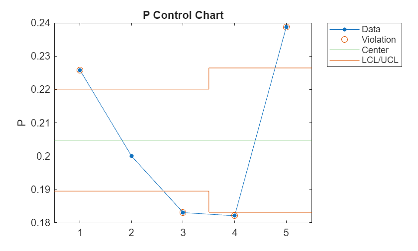
The P chart shows that only the second subgroup (Tuesday) is within the control limits, despite the fact that each P value is close to the true failure probability of the corresponding subgroup.
Display a Laney P' chart of the measurements by specifying DispersionControl="on".
controlchart(X,group,ChartType="p",Unit=1,DispersionControl="on");
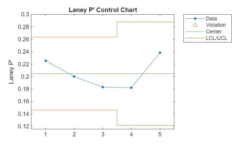
None of the subgroups are marked as out-of-control in the P' chart, because the control limits take into account the subgroup sizes and interday variations in the failure probability.
Generate simulated measurements of the number of defects in five units, taken on 50 consecutive days. Each unit has a size between 1 and 10 cm, and the expected number of defects per cm is 0.25.
rng(0,"twister")  % For reproducibility
unitSize = [10,3,5,2.5,8];  % Unit sizes
lambda = 0.25;  % Expected number of defects per cm
nDays = 50;
X = [];
units = [];
for i = 1:nDays
    defects = poissrnd(lambda*unitSize);
    X = [X; defects];
    units = [units; unitSize];
end
Create a U (defects per unit) chart of the measurements, and return the subgroup statistics and plot data.
[stats,Uplot] = controlchart(X,ChartType="u",Unit=units);
The U chart plots the number of defects per cm for each day, measured over all units. Display the value of the center line , which is the mean number of measured defects per cm, averaged over all days.
stats.m
ans =
0.2407
The value is close to the expected defect rate of 0.25. The red lines represent the upper and lower control limits, which are equal to , where is sum(unitSize). Display the value of the upper control limit.
Uplot.ucl(1)
ans =
0.5164
Create a C (number of defects) chart of the measurements, and return the subgroup statistics and plot data.
[stats,Cplot] = controlchart(X,ChartType="c",Unit=units);
The C chart plots the number of measured defects on each day. Display the value of the center line , which is the mean number of measured defects, averaged over all days.
Cplot.cl(1)
ans =
6.8600
Display the value of the upper control limit, which is equal to .
Cplot.ucl(1)
ans =
14.7175
Display the total number of defects and defects per cm for day 49.
Cplot.pts(49)
ans =
15
Uplot.pts(49)
ans =
0.5263
The function marks day 49 as a violation in both charts, because its total number of defects and defects per cm exceed the upper control limits.
Input Arguments
Name-Value Arguments
Output Arguments
More About
References
[1] Montgomery, Douglas C. Statistical Quality Control. 7th ed. Nashville, TN: John Wiley & Sons, 2012.
[2] Laney, David B. “Improved Control Charts for Attributes.” Quality Engineering 14, no. 4 (June 18, 2002): 531–37.